

“Every colour has its personality and a different impact on us. Colour sends out a vibration like every person does. This vibration interferes with that of its onlooker. That’s why we like certain colours and dislike others even if this is mostly unconsciously.”
Klausbernd Vollmar, Scientific Psychologist, Author
Welcome to Tea Toast & Trivia.
Thank you for listening in.
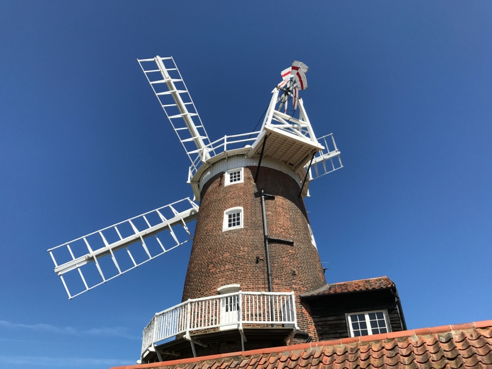
I am travelling over 7,500 kilometers to Cley-Next-The-Sea, an idyllic artists’ village situated on the River Glaven in Norfolk, England. I am meeting up with my dear blogger friend, and professional author, Klausbernd Vollmar, who is an authority on colour theory and in the language of symbols in dreams and art.
Klausbernd Vollmar graduated with a (MA) in German and Nordic literature, philosophy, geology, and linguistics at the University of Bochum/Germany. In Finland and Germany, he worked as assistant professor specializing in symbol systems. Winning a postgraduate scholarship by the Canada Council, he came to Canada and worked for four years as lecturer at the McGill University/Montreal. He was an editor of several magazines in Germany, Canada, and Greece.
Klausbernd studied and graduated in general and clinical psychology at the Ruhr-University/Germany. Working in Germany and England in a private practice, his writing specialized on colour and symbolism. His website is www.kbvollmar.com
I enjoy following the extraordinary adventures of The Fab Four of Cley on their blog, The World According to Dina. I continue to learn from the vibrant discussions that open new avenues of exploration.

I am thrilled that Klausbernd has graciously agreed to share his insights on colour theory with us on Tea Toast & Trivia podcast. He wrote that “I dealt life long with colours as my friends.”
This is your invitation to join Klausbernd and me in an extraordinary conversation on the vitality and influence of colour in our lives. So, put the kettle on add to this exciting discussion on Tea Toast & Trivia.

Thank you, Klausbernd, for sharing your knowledge on colour and how it influences our lives and interactions with others and connection with nature. I appreciate our friendship that has evolved over the past years and the many conversations that are yet to come. You inspire us all with your commitment to foster a compassionate community spirit.

Dear listeners, Thank you for joining Klausbernd and me on Tea Toast & Trivia.
And remember – you are only an internet click away from Klausbernd on The World According to Dina, where you will meet up with The Fab Four of Cley. It is a place that welcomes life-affirming discussions. Until next time, stay safe, be well.


94 replies on “Season 2 Episode 50: Klausbernd Vollmar on Colours of Life”
[…] listening platforms including Apple, Google and Spotify. They are also published on SoundCloud and TeaToastTrivia. From there it’s shared on Facebook, Instagram and Twitter.You are very welcome to listen to […]
LikeLiked by 1 person
Dear Rebecca, dear Don,
thank you very much for having produced this podcast with me. You created such an easy and productive atmosphere. It was fun and inspiring working together with you, and I am looking forward to our next production about beauty.
With big hugs from the little village next the big sea
Klausbernd 🙂
LikeLiked by 6 people
Thank you, Klausbernd for joining Don and I on TTT. You bring a wonderful sense of community in your conversations that welcomes new ideas and new discoveries and excellent discussions. We may have been separated by a continent and ocean, we felt that we were all in the same room. Don and I were disappointed that we could not travel to your side of the world this September, but connecting virtually was the next best thing. We are looking forward to our next conversation on beauty. “Beauty is a manifestation of secret natural laws, which otherwise would have been hidden from us forever.” Johann Wolfgang Von Goethe (I have no idea what this means, but I know we will be discussing it in our next podcast.). Sending hugs and love along with our gratitude to our dear friends, The Fab Four of Cley.
LikeLiked by 5 people
Wonderful broadcast. You both sounded amazing.
LikeLiked by 6 people
Thank you for listening in, Shehanne!! What an adventure we are on. We live in a time where technology takes down the barrier of location. Soon there is be an app that allows us to step through our computer screens to the other side of the world. Take care, my dear clansister.
LikeLiked by 4 people
Dear Rebecca
Indeed, modern technology presents us big chances of communication that makes sense and is meaningful. We can connect in a way we never could before. It’s on us how we use it. You, dear Rebecca, took the chance and provide a professional platform for meaningful communication. Thanks a lot!
With lots of love
Klausbernd 🙂
LikeLiked by 2 people
and you xxxxxx
LikeLiked by 1 person
Thank you VERY very much! 🙂 🙂
Wishing you a wonderful rest of this week
Klausbernd 🙂
LikeLiked by 1 person
Dear SheHanne
thank you very much. You are so kind.
All the best
Klausbernd 🙂
LikeLiked by 2 people
I am calling it as I see it. A pleasure to listen in on this one.
LikeLiked by 2 people
Thank you 🙏 🙏
LikeLiked by 1 person
What a lovely presentation and a great broadcast. You are an amazing host, Rebecca. You are spot-on for this kind of broadcast with your smooth voice and interesting and intelligent questions. The co-production Tea, Toast and Trivia with your husband Don already sounds award-winning. You are ahead of us all with this new medium, open-minded and open-hearted, always eager to learn and study. Over the years, I have listened to hundreds of interviews with Klausbernd on the subject of colours. This time I learned something new, mainly because of you and your approach. Congratulations, Rebecca, Don and Klausbernd.
Big hugs from Cley
Dina x
LikeLiked by 5 people
Thank you for your heartwarming, encouraging comments, Dina. Klausbernd’s knowledge and experience is extraordinary and I look forward to many more conversations. What I found fascinating was how Klausbernd brought out the personalities of Newton and Goethe – he brought them to life – and how humanity gained knowledge over the centuries. We are surrounded by colour and yet know so very little about how colour influences who we are, the choices we make, the connections we seek. Since our discussion, I have been looking into Goethe’s theory of colours and found this quote “The highest goals that man can achieve is amazement.” Goethe, Theory of Colours. Sending many hugs and love your way, Dina!!!
LikeLiked by 6 people
Thanks a lot, dear Rebecca 🙏 🙏
it was really fun working together with you and Don. People are often not aware of how important the role of the interviewer is. She is as important as the person who is interviewed. You did a really good job 👍 THANK YOU.
Hugs and love xx
Klausbernd 🙂
LikeLiked by 2 people
You’re absolutely right about the role of the interviewer, Klausbernd, and Rebecca is very, very good at it.
LikeLiked by 2 people
Thank you Liz!! Your support and encouragement is truly appreciated. Many hugs!!!
LikeLiked by 1 person
You’re most welcome, Rebecca!
LikeLiked by 1 person
Thank you very much for your kind comment, dear Dina 🙏 🙏
You are absolutely right, Rebecca organised it all perfectly well and asked inspiring questions as she was very well prepared.
❤ ❤ Klausbernd 🙂 xxx
LikeLiked by 3 people
An extraordinary subject, interview and sharing of information. This is absolutely top of the line, Rebecca. It is of particular interest to me, having spent the largest part, of my held business life, in the graphic arts world and of course said design world, slash industry. As part of an unusual world, to say the least, it is hard to forget the early days of long nights to wee hours, in the press rooms, approving colours.
What a fascinating read and listen, both introduction and interview, not to mention a giant memory nudge to my past. Thank you, and of course your guest, Klausbernd Vollmar, ever so much for this wonderful treat!
LikeLiked by 5 people
Thank you for listening in, Jean-Jacques and for your descriptive comments I am imagining you, as a young man, working late into the night in the press rooms, approving colours, deciding on this colour or the other. I would love to explore the connection between poetry and colours. This was brought out in your poem: Kaleidoscope Life – plays man’s mind –
“What of our stay
In kaleidoscope life,
Youth bids trust
Inalienable so,
Time here be rife
To ensure follows,
Yet soon find doubt
Be but virtual tout….
Innately deceptive
Ominous purpose,
Plays man’s mind
Of fragile compass,
Wants survive
The morrows’ circus,
Hence ruse the gods
To so perpetuate,
This kaleidoscopic life!”
Let us be grateful for colour, words and great conversations. Sending many hugs to you and Marianne.
LikeLiked by 4 people
Dear Jean-Jacques,
thank you very much for your kind comment.
I actually always liked the world of design. And you would laugh, I worked for product design as well for the colour of scales and household utensils, colours in architecture and of cars.
All the best
Klausbernd 🙂
LikeLiked by 3 people
I truly appreciate you’re taking the time to respond, and I as well liked and enjoyed that part of my world for many years.. Thus so because when I think back I also find stages of my life’s occupation, in retrospect seem rather funny.
But as to colour in and of itself, that is a whole other matter. I started scribbling, so to speak, in the medium of poetry until it dawned on me that I had reached a point of actually writing in that language. All this to say that in my opinion, without colour and the use of it, as a writing tool, I surely could not have encouragingly persisted in this writing addiction for some forty years plus. Words are a form of colour, and colour is an essential element that gives life to words. Like you said, for the most part, much of the time we are not viably aware of the colours that surround us, within and without our being, or words to that effect, but it is most definitely there and feel-able. Hence to make my point, here is a sample, as in a poem I wrote a few years ago;
“ Colour Me Human ”
~ in the colour of life ~
Colour me human
Be her ambition,
In world to imbue,
With exacting will
Wants vibrant hue,
Says ‘tis reflection
Of colours be true,
In shades held free
Save colour of blue,
Wouldst imply sad
Begs colour renew,
In the colour of life
Be the colour of you…
So colour me please
That I hypothesize,
To accept with ease
I’ll find empathize,
Fading life shades
May not so apprise,
We’ll soon turn blue
In a dank shady haze,
Not colour you chose
To best colour me too!
ode to Marianne,
whose colour be love…
© Jean-Jacques Fournier
LikeLiked by 4 people
I must recite that poem, Jean-Jacques. “To best colour me too! Ode to Marianne, whose colour be love….”. Beautiful Colour throughout!!!!
LikeLiked by 2 people
Great to hear KB talking! Of course, his theories about colour are both interesting to hear, and completely convincing too.
Best wishes, Pete.
LikeLiked by 5 people
I am delighted you listened in, Pete. Thank you for your comments. Isn’t it wonderful to hear Klausbernd speak about colours. I did not know how much colour influenced my life. I always loved and still do the colour “red” but when I look back, I wonder if my determination to love this colour was based on everyone telling me that “green” was my colour and that children with red hair should never wear red. Oh, the complexity of life!!!! Have a wonderful day.
LikeLiked by 4 people
I once had a pale blue painted room. Everyone told me that it made them feel cold, but it made me feel calm. 🙂
LikeLiked by 3 people
How interesting!!!
LikeLiked by 1 person
Dear Rebecca,
with red hair green suits you very well. Combining complementary colours is beautiful goes back to the normative aesthetics of Goethe. The idea behind this: wholeness is beautiful. With complementary colours, you combine all primary colours, f.e. red and green = blue + yellow.
Love xx
Klausbernd 🙂
LikeLiked by 2 people
Thank you very much, dear Pete.
I hope you get well soon and we’ll see each other.
With love
Klausbernd 🙂
LikeLiked by 2 people
Dear Pete,
a blue room makes you feel calm and it feels colder as it actually is. That was tested with a room temperature of 15 degrees C. It feels cold in a blue room but warm in a red or orange room. Blue makes you feel relaxed and reduces your blood pressure.
Klausbernd 🙂
LikeLiked by 3 people
That is a very interesting idea, about being able to sense colours without actually “seeing” them (in the case of blind people, for example).
I agree that colour is attached to our emotions, memories, and past exposure to it. We all know what we like and what we don’t like, but most of us don’t know why that is so.
LikeLiked by 5 people
So very well said – “we don’t know why that is so.” I agree wholeheartedly – we see colour but don’t understand how we respond to their presence. For many years, I preferred white paint for the interior of my home and added colour sparingly. And then one day, I had an “awakening.” At the time, I was completing my MBA, had a complex career etc which made my days seem chaotic. I realized that the white walls were simple and did not make any demands, which is why I chose the particular colour. From that point onward, I became very interested in colour and colour theories. Meeting up with the Fab Four of Cley has been a wonderful exploration into this area of learning. Dina’s photography adds to Klausbernd’s discussion. (P.S.Now, my house if full of many colours.). Thank you so much for listening in and for your comments – very much appreciated.
LikeLiked by 5 people
Dear Rebecca,
to a certain extent, we can manipulate our feelings and even our thinking with colour. Actually, we do it often quite unconsciously. But sometimes it goes in the wrong direction because we are influenced by fashion etc. It helps to understand the effect of colours that this doesn’t happen.
HUGS
Klausbernd 🙂
LikeLiked by 2 people
Dear Anneli,
thank you very much.
Well, we may know what we like but if that is good for us is another question. Understanding helps to make the right decision.
Thanks and cheers
Klausbernd 🙂
LikeLiked by 2 people
That’s true.
LikeLiked by 2 people
This was fascinating on so many levels it would take about twice as long as the original conversation to discuss them all.
My partner is slightly red green colour blind and struggles to see the red flowers and berries on trees that sing out to me. Proving what Klausbernd said that all reality is subjective as it relies on Individuals perceptions and the individual emotional experiences that colour those perceptions.
And yes my favourite colour which does put my level of maturity at about 4 years old. At least something remains eternally young. Alyhough I’m not too sure that is something I should brag about.
The idea of blind people sensing colour was something I first read about years ago in Lyall Watson’s remarkable book Supernature – an idea that suggest people can sense the different electromagnetic wavelengths that causes visible light to be seen as a colour, again just as Klausbernd said. Given that, one wonders if it can be related to the colours of a person’s aura which can be seemingly captured by kirlian photography.
Things like this really shake you out of complancy and make you look at the world in a new way. Stupendous.
Paul
LikeLiked by 4 people
Thank you, Paul, for listening in and for adding depth and breadth to this conversation. I just found Lyall Watson’s book “Supernature”. Thank you so much for the intro. Always exciting to read in the first pages, “The subject matter of most of this book is so controversial that I have felt it necessary to give detailed references to all my sources of information.” When I was a child I used to watch a cartoon called “The Jetsons” which had people talking on the telephone through a screen, very much like our FaceTime and Zoom applications. And here we are. Can you imagine thinking that the world was flat? The story of humanity is one of curiosity and knowledge acquisition, which has always been a tumultuous history. May we continue to embrace learning as one of our greatest gifts!!! Your comments are heartwarming and very much appreciated.
LikeLiked by 3 people
If you like Supernature can I suggest a couple of equally ‘oblique strategy’ books. They would be Robert Graves The White Goddess and Pauwels & Bergier’s Morning of the Magicians. I read both years ago and they created a revolution in my head.
Graves’ book examines poetic truth, which has little to do with empirical or historical truth and has been slammed for it, but as a course in understanding the complex relationships between mythology and poetry, it can’t be beat.
Morning of the Magicians has a hell of a lot of ‘weird shit’ in it (I’m not swearing it’s just an old hippie term- from a bit of an old hippie). They describe to book as being a multi-purpose tool not necessarily to be read in sequence but used as the need arises. As a young man it blew my mind.
The term oblique strategies was invented by minimalist avant-garde popster Brian Eno, as a way of breaking muscians out of a rut by encouraging creativity and developing spontaneity through lateral thinking. It is a series of cards with suggestions like ‘play like it is raining’. Perhaps the most relevent in relation to the above books is ‘Honor thy error as a hidden intention’.
Ooh la la… how very I Ching.
LikeLiked by 4 people
PS Loved Loved Loved the Jestsons
LikeLiked by 2 people
Dear Paul,
thank you very much.
I suppose truth can’t be found in one way of explaining it always needs several explanations. Niels Bohr said once that truth is only true if it’s opposite is true as well. I have the feeling that just one explanation can’t really grasp reality (and it quite often shows the tendency of being populistic). Reality is more complex. We have to be aware that our explanations are just one possibility of many. You wrote it that nicely by quoting those blind men describing the elephant. Thank you.
Now it’s time for a late-night drink. Cheers 🥂
All the best
Klausbernd 🙂
LikeLiked by 3 people
Dear Paul,
well, we both seem to have a hippie past. I lived during my hippie times in a farm community in Vermont, not far from Woodstock. Anyway, I have read these books you are quoting as well and actually a close relative (the grandson?) of Robert Graves lives just around the corner and has a bookshop in our next market town
https://voewood-books.myshopify.com/pages/about-us
Anyway, as I wrote before, there are different kinds of realities and one can see reality scientific, poetically or magic f.e. All these layers of reality make the ‘real reality’. Well, that’s my idea.
Good night
Klausbernd 🙂
LikeLiked by 2 people
Dear Paul,
concerning colour blindness, it is interesting that much more men are colour blind than women. That matches with the fact that women are able to differentiate much more shades of colours than men. For women, colour is more important than for men, as I said forms have the priority for them.
If you believe in auras and Kirlian photography you have to see that you see outside colours through the colour of your aura. You could understand this as a metaphor meaning that your emotions are influencing how you perceive colour.
Thanks for commenting.
Keep well
Klausbernd 🙂
LikeLiked by 3 people
That is a very good point about emotions influencing colour perception. I do not know if I believe in either auras or Kirlian photography (as a photographic representation of the life force) however it is not inconveivable both capture some perceived aspect of a biomagnetic field encompassing life. Perhaps, we, like the 5 wise men looking at an elephant through holes in a fence (one sees the leg and says it is like a tree; another the trunk and describes it as a snake), only ever see one aspect and think it is the whole. And of course, as you said ,all our perceptions are channelled through our senses which are subjective and processed by the equally subjective brain. Thanks once again for your excellent insights. They have really set me thinking. Best Paul
LikeLiked by 3 people
Oh dear, dear Paul,
I just see something went wrong with the order of my answers to your comments. Sorry!
Stay well
Klausbernd 🙂
LikeLiked by 1 person
Fascinating discussion linking culture with color, as well as the physiological aspects. Also interesting for me was learning in college a theory that people hear differently from one another based on anatomy of the ear and genetic variations. So we run the gamut from perfect pitch to tin ear. It seems observing color is also like that, so that with mixed colors (my personal favorite), some will see more of one color than another. My son and I ‘argue’ frequently about the blue/green thing. I agree with Klausbernd that exposure and education about ‘how’ we see color can help develop consensus for exact ‘shades,’ but I’m also convinced that subjective differences are at least partially based in anatomy and genetics. It was nice to ‘meet’ your frequent blogger friend whose comments color your own blog 🙂
LikeLiked by 4 people
Dear Mary,
thank you very much for commenting.
I know those blue/green discussions as well. In what you see as blue or as green seem to show quite well that we see colours differently. But there is another argument saying that this has to do with language, with what we call a certain colour. I didn’t touch that field of colour and language in this podcast. The problem is that we are nor able to name colours exactly. The only way would be with the parts of CMYK, so a pure yellow would be C0 M0 Y100 K0, but nobody would talk like this in everyday life.
Test show that it’s more cultural differences that determine how we see colour than anatomic differences. How we see forms is more dependent on anatomic differences especially the background of our eyes like in astigmatism.
Wishing you a wonderful day
Klausbernd 🙂
LikeLiked by 3 people
Thank you to you both (and to Don for his professional post-production)for this valuable conversation about color. I not only enjoyed every word but also learned so much about color and the way it effects, broadens, adds joy and excitement to our lives. I learned so much about yellow and its effect in our daily lives–it had not been my favorite color, now this conversation has revealed its immense value to each day. May favorite color is blue, now I understand a little about the reason. I have read the discussion and responses that others have added and found them at a high level of understanding. I really enjoyed the poems. Again, thank you and I will be waiting for the next inspiring conversation.
LikeLiked by 3 people
Thank you for listening in Frances! I always enjoy our conversations over tea and toast. Klausbernd has a marvelous way of introducing us to new insights into colour. Once we understand more about how individual colours influence our lives, it gives us a richer appreciation for every shade and nuance. I agree wholeheartedly, the discussion has added depth and breadth to my understanding! Thank you for your presence and comments – you always make my day!!!
LikeLiked by 2 people
🌿💚🌱THANK YOU, Clanmother! Fantastic conversation. I can only imagine the huge amount of time and research you put in to produce these educational blogs. Each one is truly ourstanding!
LikeLiked by 3 people
You have been my strongest and most loyal supporter for many many years! Thank you.
LikeLiked by 2 people
Dear Rebecca,
I see it’s ideal, on one hand, the podcast and on the other hand the communications here, these comments. So the understanding of the topic can get deeper if visitors wish to.
Lots of love
❤ ❤ ❤
Klausbernd 🙂
LikeLiked by 3 people
I agree wholeheartedly, Klausbernd. This has been an extraordinary conversation.
LikeLiked by 1 person
Thank you very much for your kind comment.
Maybe I am someone who can make people understand yellow better as I really love a bright yellow and yellows with a little tint of red. For me, it’s connected with joy, with light and summer. It’s a colour of activity as well, especially intellectual activities like communication. Therefore in most countries. yellow is the colour of the post-service and for communication cables. The gesture of yellow is to spread out, to shine, it’s extraverted whereas blue is introverted and conservative. Therefore it’s the colour of most of the conservative parties in the western world. Yellow is the colour of the liberal parties.
Anyway, there is so much to say about colour …
Now I am preparing another endless topic for our next podcast here that’s ‘beauty’ .
Wishing you a wonderful weekend
Klausbernd 🙂
LikeLiked by 2 people
Thank you so very much for your wisdom that can only come from much study and experience. Thank you especially for your comments about the color, yellow. I appreciate!
LikeLiked by 2 people
You are very welcome.
I am happy tho read this.
Wishing you a wonderful weekend
Klausbernd 🙂
LikeLiked by 1 person
Dear Rebecca, thank you for this marvelous discussion with Klausbernd, and superb editing by Don. Color is a favorite topic with me. I’ve long said that I have a physical need for color. If I’m dressed in all neutrals I don’t even feel well. Living in Washington DC for a decade, I quickly came to call the way most people dressed “DC drab”. I rarely saw anyone wear a color. I used to wear every color, including black. However, so many people dressed in black every day that I couldn’t stand to wear it any more (except as pants with my signature brightly colored blazers).
I enjoy working with color correspondences for the days of the week. I find it fascinating that so many ancient cultures had that, although not always the same colors for a given day. Wishing all of you a colorful weekend. Hugs on the wing!
LikeLiked by 4 people
I am delighted that you listened in, Teagan. I am looking forward to Klausbernd’s podcast on “beauty.” Your comments resonated. I love black for its simplicity and elegance, but one must have colour. I especially appreciated your words: “I have a physical need for color.” I share that need. By the way, I have been having difficulty with my internet connection last week (off and on, but mostly off line) Klausbernd indicated that “blue” was a calming influence. So, taking a deep breath and looking at the colour “blue” has been very helpful. Maybe that is why we look to the sky for respite. And speaking of blue, I am so excited that I received your book “Hullaba Lulu” in my mailbox yesterday. I LOVE your choice of blue for the title and your name. Sending hugs back on the wing.
LikeLiked by 2 people
Oh, thanks for letting me know that Lulu arrived.
It’s funny, people and computer monitors all read a given color slightly differently. I tried to get the cover’s text to match her dress. I would get the sample box to match perfectly, yet it looked different (once I selected the color). Very frustrating. I finally decided to go with the flow.
I’m not good with “beauty”… my therapist is working on that with me. I think she’s fighting a losing battle on that topic. But I’m sure it will be a lively discussion with you and Klausbernd. More hugs!
LikeLiked by 1 person
Thank you, dear Teagan!! You are an amazing storyteller! I have been thinking a great deal about beauty these days. We love beauty, want to posses it, and even be the object of beauty. But we are betrayed by our definition of beauty. In many ways, your words, “she’s fighting a losing battle” refers to all of us. Thank you for adding depth and breadth to this conversation. So very much appreciated. Hugs!!!!
LikeLike
Thanks for commenting.
Black and grey are colours that go well with most of the other colours and suit most of the people quite well. Therefore these colours never went out of fashion. At least here in Europe black has a long tradition being the colour of the intellectuals and artists. The scholars of the middle ages wore black and from the 14th c. onwards it was the colour of the bankers. In the 20th c. it was the colour of the anarchists, existentialists and nonconformists and if you visit design studios you’ll notice that most of the people wear black there. It’s the most liked colour of lingerie because it contrasts perfectly with the skin and it connotates a secreet. But it is the colour of authority and power as well.
In most European cultures Monday is connected with blue. That goes back to the middle ages as well. The Dyers like all folks weren’t allowed to work on Sundays. Therefore the soaked wool and linnen on Sundays and did hang it around the towns on Monday. The oxidation made the wool and linnen turned blue then. So the towns were surrounded by blue on Mondays as you can see that f.e. in the ‘Stundenbücher’ of the three Limburg brother.
All the best
Klausbernd 🙂
LikeLiked by 2 people
I greatly enjoyed this fascinating discussion on the science of color. It took me a while, but I came to the realization that I would wear pink to work on certain meeting days thinking that if I did, people wouldn’t be mean to me. Perhaps I should have invested in a black power suit instead. 😉 I look forward to your next conversation with Klausbernd.
LikeLiked by 3 people
As I write this comment, I am wearing a pink top with white and beige sprinkled about the material. I loved red as a child and still do! But I was always told that green was my colour. So when I received a birthday present that was “cash” I bought myself red pants and wore them boldly. It was a salvo of freedom. I am looking forward to Klausbernd’s insight on beauty, too!
LikeLiked by 2 people
🙂 Red pants are definitely a bold statement!!
LikeLiked by 2 people
Only a child of 10 would dare!!! LOL!
LikeLiked by 2 people
Ha ha ha! 😀 😀
LikeLiked by 2 people
Dear Liz
thanks for commenting and that you like Rebecca’s and my talk about colour.
I like the combination of pink and grey. But writing this I wear blue and brown, well, I haven’t decided yet if I like this colour combination.
All the best
Klausbernd 🙂
LikeLiked by 2 people
You’re welcome, Klausbernd. I’m partial to the pink and grey combination myself.
LikeLiked by 2 people
Such a professionally produced podcast and on a great subject. I love surrounding myself with colour, much to the angst of my sister who prefers to decorate “Hampton Style”.
LikeLiked by 2 people
I am delighted that you added to our “colour” conversation. I share your love of colour and have vibrant colours throughout our home. For 25 years, I had white walls until one day, I fell in love with colour all over again. Thank you for your heartwarming comments – so very much appreciated.
LikeLiked by 2 people
Dear Rebecca,
there is a history of having your walls painted white. It actually started with small rooms like toilets. They had white walls to make them appear bigger. Big rooms like in halls and country houses always had colourful walls. As stronger the colour of your walls as bigger the rooms have to be not to appear constricting.
It started in Baroque already that architects thought about the effects of colours in rooms.
With love and hugs from sunny Cley
Klausbernd 🙂
LikeLiked by 2 people
Dear Klausbernd – you add so much to my knowledge about colour. What do you think of this idea: My love of “white walls” was during a period of when I was in a robust academic program while in a high-stress work situation. When I came home, the white was uncomplicated. When the stress was reduced, I rediscovered colour. Do you think that certain colours add to stress levels. Is it possible to have “colour overload”?
LikeLiked by 1 person
Dear Rebecca,
indeed, certain colours can add to stress levels. During my studies of psychology I specialised on perception. We tested the influence of different colours on the stress and concentration levels. The design of the experiment was quite a sophisticated text shown to test subjects for a short time. The background of the text was changed between the 6 different colours. We found out that the red background made it harder to understand the text because the arousal potential of the test subject was high. Best was white and therefore text in books is printed on white. We did a lot of other tests as well and found out when you are stressed you see colours more towads grey. This neutral grey is stabilizing, that means this perception of a grey shine is a kind of self-healing.
Lately I read in an architecture magazine that an interior designer made the point that in a room with with white walls the persons being in this room becoming more important.
To my experience we have phases how we like our interiours designed colourwise as we have phases of which colour we like to wear.
We can clutter interiors with colours and this produces a certain (unnecessary) stress level.
Thanks for your interesting questions. Wishing you a wonderful day. Keep healthy and happy
Klausbernd 🙂
LikeLiked by 1 person
I never thought about the idea that text in books is printed on white. And here is another example of the ubiquitous nature of colour. We just assume that books are the way they are, but rarely do we think of the reasons behind this colour decision. Black background and white text is dramatic, but would be disastrous for long term reading. Thank you again clarifying how stress and our emotional status is influenced by colour. You just made my day pure sunshine 🌞. Sending hugs and love to The Fab Four of Cley.
LikeLiked by 1 person
At my first computers the background colour of text was a (horrible) green. The idea was that green relaxes. But surely not this shade green. Black writing on white background is ideal. It’s easy readable not only because of the strong black-white conrast.
Sending you lots of love from all of us
The Fab Four of Cley
🙂 🙂 🙂 🙂
LikeLiked by 1 person
Oh dear, dear Gwendoline, we have decorated our house “Hampton Style” as well after we had it quite colourful before. These grey and white tones make the rooms lighter and appear bigger. The bookshelves are another reason for us because all the book covers are quite colourful so they add colour to our rooms.
Thank you very much for commenting.
Keep well and happy
Klausbernd 🙂
LikeLiked by 2 people
I vividly remember your makeover for the library/reading room and I am drooling over it. Here in my retirement apartment complex we are “required” to have white walls, although I have painted three feature walls; one a vibrant red, another a metallic gold, and a desert sand in our bedroom. But the furnishings we can do what we like with, so I have lots of colour splashes, including a Hungarian folk embroidery which should be a coffee table covering but I had framed and hung in the living room. My sister, however, would stick strictly to the white, cream spectrum for everything, walls, furniture, cushions, etc, with touches of silver in her decorations. It is classy and elegant, just not for me!
LikeLiked by 2 people
Dear Gwendolin,
yes, in our library everything is white but we have a couch there with strong colours, an Indian design. It has these colours you see as background colours of my podcast with Rebecca. If everything is white then pieces with strong prismatic colours are getting more accentuated.
It sounds interesting how you designed the colour combination of your appartment. Red and gold sounds very brave to us.
Thanks and cheers
The Fab Four of Cley
🙂 🙂 🙂 🙂
LikeLiked by 2 people
Sorry, dear Gwendoline, I just see that you can see this couch on the picture here on the right. But in our library, where this picture is taken, the real background is white.
Have a happy day 🙂
Klausbernd
LikeLiked by 1 person
Dear Rebecca, I was convinced that I had written to you concerning this very inspiring podcast with Klausbernd, but I couldn’t find it! Anyway, have come back, because I want to listen to it again with my friends, hoping that they will enjoy it as much as I did.
Bit hug Martina
LikeLiked by 3 people
I am so very very glad you came back with your friends. Your visits are very much appreciated. I think that your heartwarming comments were on “The World According to Dina” blog. Sending hugs and more hugs
LikeLiked by 2 people
Dear Martina,
thank you very much for listening to this podcast about colours and that you will listen again with friends. GREAT!
With love and wishing you a great weekend
Klausbernd 🙂
LikeLiked by 2 people
It is thanks of you, dear Klausbernd and your creative team that my friends and me will have a very pleasant “tea, toast & trivia”, listening and chatting about your colour theory and many other subjects included, of course wearing the mask!!:)
The same to you 4 in cley. Very best regards Martina
LikeLiked by 2 people
Dear Martina,
have fun listening with your friends and have a wonderful weekend.
Warm greetings from the cold sea
The Fab Four of Cley
🙂 🙂 🙂 🙂
LikeLiked by 2 people
Klausbernd, Rebecca – I really enjoyed this podcast.
So much came to mind.
As a Costume Designer in film, colour is immensely important.
The Production Designer & Director pick a palette. The Director of Photography may love the palette for the mood of the film, but perhaps the palette does not translate properly, due to lighting or whatever, and I may be asked to tech certain pieces (especially whites) with a tan beige or grey.
Then the important actors may not like certain colours in the palette. So I must be careful to design their wardrobe accordingly. This creates a ripple effect of choosing the right colours, through all other characters.
Of course wardrobe must record all of the costumes for continuity purposes. Photos are good, but not always colour perfect, so we have colour descriptions like: burnt pumpkin, leafy lime green, dusty rose pink, soft golden yellow, tamarind pink and the colour descriptions go on & on.
Klausbernd mentioned yellow, as a fave at some point of his life.
When I was about 12, I went to summer camp. I had not thought much about colours.
I met a girl who told me her favourite colour was yellow, because she felt sorry for it.
When I thought about it, I didn’t like yellow. However, not wanting any colour to be unliked, I began telling everyone my fave colour was yellow. My choice was emotional. However, my life of colour had begun.
Finally, and most importantly, I know that blind people have a sense of colour.
I had a friend who went blind, and began painting. I did a post for him, as he was attempting to sell his art. https://graffitiluxandmurals.com/2018/01/11/blind-artist-seeks-audience-for-his-fab-art/
He has since passed away, but he was a huge inspiration to me.
Just because it’s dark, doesn’t mean we can’t see.
Just because it seems like the end, it could be a beginning.
LikeLiked by 3 people
Thank you, Resa, for adding your insights and your recollection. I especially appreciated your words: “My life of colour had begun.” Whenever I think of yellow, I think of following the yellow brick road for there is always an adventure waiting to happen. I am so glad you listened in – I knew you would enjoy Klausbernd’s thoughts on colour. Thank you for the link to your post about Vernon Milette and his amazing artwork. I thought that I would add the video of your work as a Costume Designer: https://vimeo.com/28484725.
LikeLiked by 2 people
Dear Rebecca,
when I think of yellow I think of my childhood in Sweden. The yellow cross on the blue background is so present in Sweden that yellow is associated with Sweden for me. That was an idyllic life in nature like in Astrid Lindgren’s “The Children of Bullerbyen Village”.
I was always amazed when I was in a film how sophisticated the camera has to be adjusted like white balance, choosing the filters etc. And I see it when Dina is working on the perfect colour effect of her pictures starting with adjusting her camera and later working on the image in photoshop. To find the ‘right colour’ is digital art nowadays.
From the warm and sunny sea big hugs and xxx
Klausbernd 🙂 and the rest of our gang
LikeLiked by 1 person
Dear Klausbernd, Astrid Lindgren saved me with her marvelous character, Pippi Longstocking. I was 8 years old when I first met the teacher who would change the way I looked at education. As I look back, she was very ill and in pain, which was a contributing factor to her bullying tactics. I dreaded going to school and was very pleased when chicken pox kept me home for three weeks. That is when I met Pippi, Mr. Nilsson and Pippi’s beloved horse. Pippi’s exuberance for life, her courage, strength and optimism was unstoppable. . She played by her rules, which I knew to be very wise, even at my young age. I had red hair and plenty of freckles, so if she could say “Don’t you worry about me. I’ll always come out on top” I could too. The school year passed and when I entered a new year in a new class, I sent a thank you note to my last year’s teacher, who met me in the school hallway to return the thanks with much surprise. What Pippi taught me was kindness was the greatest strength. I found the film “The Children of Bullerbyen Village” on Youtube. I understand completely what you meant about adjusting the white balance and choosing the filters. The colours are indeed rich and comforting. Thank you for the warmth and sunshine. It feels so good now that Autumn rain has come to Vancouver. Lots of hugs and love to my dear friends, The Fab Four of Cley.
LikeLiked by 1 person
Good morning, dearest Rebeca,
Pippi Longstockings was my hero too at that age before I read “Karlsson on the Roof”. Then it was him. I saw the Pippi and Karlsson films much later and still liked these two characters. In both films you get an idea of the idyllic Swedish countryside. The Swedish painter Carl Larsson shows that idyllic life as well – idealised, of course. He was the Swedish representative of the Arts-and-Craft movement.
Dina is just out on the beach to photograph the highest flood of the year in the morning sun. Trying out filters and long time exposure.
Here the sun is shining and it’s quite warm. Like Indian summer.
With hugs, love ad warm greetings from the cold sea
Klausbernd 🙂
LikeLiked by 1 person
It was a fascinating podcast!
I’m very happy you met Verne, even though he is gone now. He was a dear soul, who stayed positive, in spite of going blind.
Thanks for adding my Costume Design link!
{{{{hugs}}}}
LikeLiked by 2 people
Good morning, dear Resa,
first of all, a big thank you for your commentary.
It’s funny with favourite colours, isn’t it? My favourite colour is yellow but I have hardly anything in yellow. It’s just an idea, although not an idea only because seeing yellow makes me happy.
I can imagine how hard it is to speak about colour in a way that the recipient understands it exactly. Our everyday language isn’t fit to express shades of colour. When I did illustrated books about colour even my computer and that of my editor didn’t understand each other exactly. We choose to speak about the proportions of CMYK (or RGB). We didn’t trust callibration. And with a book, it’s relatively easy as we don’t have lighting as a variable.
My wife is a photographer and always trying to get a special light and special filters to produce exactly the mood she wants. We both are nordic people and like barren landscapes under the cold nordic light.
In my answers, I didn’t explain the differene between colours of light and additive colour mixing and surface colours and subtractive colour mixing. Colour is too complex, you can’t even put the basics of colour in one podcast. Another missed out topic is how scientific theories of perceiving colours influenced styles in art history like in Pointillism (optical mixing) and Impressionism (complementary shadows).
Thanks again for your great comment.
Wishing you all the best
Klausbernd 🙂
LikeLiked by 2 people
I am the same way with blues. I love looking at the colour, but don’t own anything in blue.
My wardrobe is 85% black.
Rebecca might do a part 2 with you!
It’s a fascinating topic.
Wishing you all the best, too.
Be well!!
LikeLiked by 2 people
Dear Resa
Thank you very much 🙏 🙏
I am afraid that most of the listeners of these podcasts are not that much interested in the subtleties of colour theory. Or seen it the other way round, I am not able to present this in an entertaining way.
My next podcast with Rebecca will be about beauty.
Keep well
Klausbernd 🙂
LikeLiked by 1 person
Dear Resa,
in the National Geographic magazine of December was an interesting article about a new kind of colours. It’s nor based on pigments, what means on absorption, but on the manipulation of the molecules of the surface that only emit the wavelength one wants to have. These colours are much brighter than conventional colours. A lot of research into these colours is done by the University of Sheffield.
Keep well and happy
Klausbernd 🙂
LikeLiked by 1 person
Dear Resa,
Pantone just published the colours of 2021: It’s my favourite colour combination YELLOW and a neutral grey.
Keep well
Klasusbernd 🙂
LikeLiked by 2 people